Loblaws Email Experience Redesign
A refreshed email marketing process with a digital-first approach,
enhancing accessibility, engagement, and efficiency for a seamless customer experience.
Timeline December 2024 to April 2025
Role Visual Designer
Tool Figma
Context
An opportunity to go further.
Loblaw Companies is Canada’s leading grocery chain, operating a diverse range of retail banners. These include grocery (Loblaws, Real Canadian Superstore), party supplies (Real Canadian Liquor Store, C-Shop), fashion (Joe Fresh), and loyalty programs (President’s Choice). Each banner has its own dedicated mailing list, used to market the latest offers and products to Canadians nationwide.
Previously, these emails relied on static images sourced from print flyers, making them unresponsive to different screen sizes, inaccessible to screen readers, and prone to performance issues. This created a need for evolution - leading to the development of responsive, accessible, and digital-first email templates that deliver an enhanced user experience.
Problem Space
Digital experiences need to be purpose-built.
As marketing and advertising shift to a digital-first era, we must design with online users and their various devices in mind. With users constantly exposed to new information, our email marketing must be both striking and streamlined—guiding them seamlessly to our online and app-based shopping experiences. These platforms cannot be an afterthought or rely on repurposed print assets; they require a purpose-built digital approach.
Challenge
To develop a digital-first, accessible, and responsive email template that seamlessly adapts print-first assets for the digital landscape while remaining versatile and adaptable across all company banners.
Process
Design Principles
Scaleable and Flexible
A modular design system to ensures adaptability across banners and campaigns, maintaining consistency while allowing for easy customization.
Simplicity and Clarity
Clear layouts, concise copy, and structured visuals create an intuitive reading experience, making key messages instantly accessible.
Consistence and Familiarity
A cohesive design structure that allows different banners to create an experience that reinforces brand identity, while employing recognizable overarching elements.
First Steps
As we transition to a digital-first approach in email marketing, we chose Real Canadian Liquor Store (RCLS) as the starting point for our new design system. As a smaller banner, RCLS provided the ideal environment to test, refine, and optimize our responsive, accessible email templates before scaling them across the organization.
By focusing on RCLS first, we ensured a controlled, adaptable rollout, allowing us to address challenges and fine-tune best practices. With a successful implementation, this design system will serve as the foundation for future email marketing efforts across our larger banners, driving a more cohesive, engaging, and user-friendly experience for all customers.
Project Timeline
Growing Pains
Our first step was to translate our brand guidelines into a comprehensive digital design system - one that not only preserves brand identity but also optimizes it for a digital-first experience. This involved defining scalable design components, typographic hierarchies, color applications, and interactive elements that ensure consistency, accessibility, and adaptability across all email communications.
By establishing a structured design system, we created a framework for decision-making, allowing for flexibility while maintaining brand coherence. This ensures that every email - regardless of banner, campaign, or audience - delivers a seamless, engaging experience. More than just a visual guide, this system serves as a foundation for innovation, enabling our teams to build dynamic, high-performing emails that evolve alongside our digital strategy.
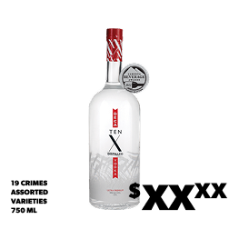
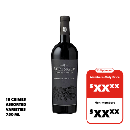
Our primary challenge was reducing cognitive load by streamlining the visual complexity of the elements inherited from the flyers. We refined key elements to create a more focused digital experience, ensuring seamless alignment with our online and app shopping platforms.
Adapting for accessibility
Old
New
We can now personalize our marketing for specific customer segments using existing data on age, preferences, and location. This not only enhances personalization but also enables advanced A/B testing, allowing us to test different programs and analyze performance before a wider rollout.
Unlocking personalization
Final Product
A simplified, accessible and responsive approach to email marketing.
Retrospective
Measuring Success
We are still in the process of A/B testing. Results coming soon.
Takeaway and Learning
Takeaway
Curating content around the user can drive "passive discovery," exposing users to experiences they might not have actively sought out.
Learning
Reducing cognitive load is key to effective digital communication. Simplifying complex visual elements from print to digital improves readability, enhances user engagement, and ensures a seamless transition between email, online, and app experiences.
Next Steps
Expanding to Other Banners
With a successful implementation for RCLS, we will refine our approach and scale the new email design system across other banners, ensuring consistency while adapting to each brand’s unique needs.
Optimize for Performance
We will continue testing and iterating on email performance, leveraging data insights to enhance engagement, accessibility, and conversion rates across all digital touch points.


